Conceptual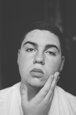 This photo was taken on December 1, 2013 by myself, Andrew Bowermaster. The main subject of the image is myself. I am framed in the center of the black and white photo and my right hand is on the left side of the bottom of my face and I am wearing a white shirt.
The main element in this image is shape. Shape is expressed in the image through myself. I am made up of lines to form one shape. The main principle in this image is contrast. There is a lot of contrast present in the image. There is contrast because of how light my white shirt is, how pale my skin is, and how dark the shadows are in the picture. In this photograph, I was trying to capture my own emotion, hence the title, conceptual. I am typically the type of person that tries to stand out as least as possible, I mainly keep to myself and am a quiet person (depending on my environment - whether I am comfortable or not). I believe I capture that in this image because of the expression on my face, and also because of my hand being in focus, trying to cover my face. I am, for the most part, happy with the composition of this picture (the contrast, shadows, etc.), but, next time I would probably spend a little bit longer taking the photos to capture more emotion. 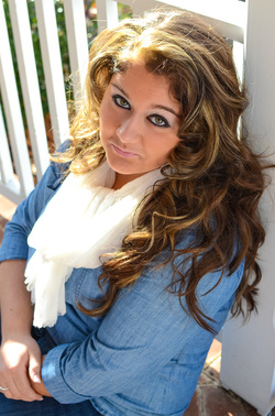 This photo was taken by myself, Andrew Bowermaster, on November 20, 2013. The main subject in the image, Scarlett, is a girl with blonde and brown hair. The girl is wearing a blue shirt and a white scarf, her right hand is resting on her left arm.
The main element in this picture is shape. Shape is shown in many different forms in this image. It is expressed in the form of the model in the image and also in the form of the railing that she is leaning against. The main principle in the picture is emphasis. Emphasis is shown because the model is the main focus of the photo. Emphasis is shown more dramatically because of the lower f-stop that was used to take the picture. As a photographer, I was trying to capture Scarlett with a very natural look on her face. I am most happy with the look on the model’s face because she is generally a person with a lot of attitude and I think the photo captures that. One thing that I would probably change next time is I would probably not cut off her arm as much.  This picture, Crossed Arms, was taken on November 14, 2013. The picture is a “portrait oriented” black and white image of a girl’s hand on her left arm, the girl is wearing a textured sweater and there is a lot of shadowing around/in front of her right arm.
The main element of art/design in the photo is texture. Not only is there texture in the girl’s hand, there is also a lot of texture seen on the sweater. The main principle of art/design that is viewed in the picture is contrast, there are many different grays, black, and whites present in the image; the colors range from dark, darks - to light, lights. I really like the composition of the image because of the lower f-stop setting that was used. I like that there is a very low field of focus, but even though the majority of the sweater is out of focus, it is still easy to view the texture and details of the sweater. The main things that grabs the viewer’s attention is most likely the black and white. Because of the dark, darks and the light, lights the image shows quite a bit of contrast, giving it a more dramatic look. Although I do, for the most part, like the way the image is composed, one thing that I would probably do different next time is take the image at a slightly higher angle so that some of the girl’s face is also in the image.  The picture, fall flowers was taken by myself, Andrew Bowermaster on October 1, 2013. The picture is a landscape oriented photo of a yellow flower bush. The picture was composed using rule of thirds and also was taken with a very low f-stop setting (1.8) so only a small portion of the bush is actually in focus. The main element of art/design in the photo is analogous colors. There are different shades of not only yellow in the photo, but also different shades of green from the bottom of the bush and also the grass at the bottom of the photo. Because of the use of rule of thirds, the photo utilizes informal balance. There are two main principles of art/design used in the photo, one of which is harmony. Harmony is shown in the image because each individual part of the bush come together to form a similar color and shape throughout the photo. The second principle shown in the image is repetition. Repetition is shown in the image because of the similar branches and flowers throughout the bush. The composition of the photo is done well because of the low f-stop setting which makes it easy to distinguish which portion of the photo is meant to be viewed. As the photographer, I was trying to capture the bright yellow color of the bush. I also wanted to have the bottom, green portion of the bush and the little amount of grass in the photo, but not as a main part of the image; that is why I chose to focus higher and use such a low f-stop. The image grabs the viewer’s attention by showing the bright analogous colors of the yellow flowers of the bush and also, the photo stands out because of the utilization of the low f-stop setting so that the viewer can distinguish right away which portion of the photographer to observe. I am most satisfied with the small distance of focus and also the use of rule of thirds. One thing that I would change if I were to retake the photo is I would have used a higher ISO setting; there was a slight overcast, so it was slightly too dark to take the photo at the low ISO setting that I did. Overall, I think that the photo is composed well, but I don't think that it is the best possible that it could be. 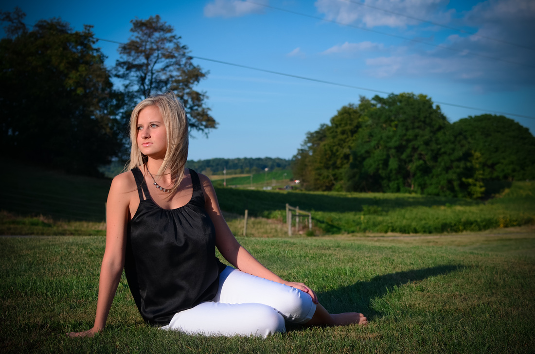 The photographer of the photo is myself, Andrew Bowermaster. The picture was taken on Sunday, September 5, 2013. I decided to name the photograph “Halle”, simply because, that is the name of the model. The picture is a landscape oriented portrait. The model is sitting in the sun, facing the light and has a very serious look on her face. One of the main elements of art/design in the photo is analogous colors; the sky, ground, and trees in the background all fall into the category of analogous colors. The balance of the picture is informal because the subject is not in the center of the picture, so there cannot be formal balance. The main principles of art/design in the photo is rule of thirds and strong light source. The subject is sitting on one of the rule of thirds and the strong directional light (the sun) is facing towards the subject. The composition of the photo was very well done because there is a range of lights and darks in the photo that creates contrast. In the photo, I was trying to capture strong directional lighting in a nice setting. Also, I wanted the model to have a very serious face while looking into the light. I wanted the subject to have a serious face because it makes the picture look more dramatic. The photo grabs the viewer’s attention because there is an obvious strong light and from seeing the model’s face, it is obvious that it’s a serious photo. My two favorite parts of the composition are the lighting/contrast and the use of rule of thirds. The main problem that I have with the photo is I wish that I would have used a lower f/stop so that I could have had the background a little less visible. I rated my photo a 3 out of 3 because of the strong composition technique and also because the image captures the attention of the viewer. | Andrew BowermasterDigital Photography II ArchivesJanuary 2014 Categories |
 RSS Feed